User Manual for WowChartv3 DNN Module
Table of Contents
Home 2
Before Getting Started 2
Activate Module 3
Getting Started 4
Data Sources 5
Predefined Data Source 5
SQL Data Source 6
CSV File Data Source 8
Great Features 10
Drilldown 10
Chart Switcher 10
Filters 11
Chart Options 13
General Options 13
Config Options 14
Title Options 15
SubTitle Options 16
Legend Options 17
X-Axis Options 18
X-Axis Label Options 18
X-Axis Range Color Options 20
Y-Axis Options 20
Y-Axis Labels Options 21
Y-Axis Range Color Options 21
Tooltip Options 23
3D Options 23
Data Label Options 25
Captions 26
Drill Down Options 27
Export Options 27
Series Colors 28
X-Axis Points Colors 28
Module Preview 28
Home
WowChartv3 is a charting Module offering an easy way of adding interactive charts to your DNN sites. Designed with mobile browsers in mind, everything from multitouch zooming to touch-friendly tooltips responds great on mobile platforms.
Before Getting Started
Are you familiar with chart or graph portions? see below
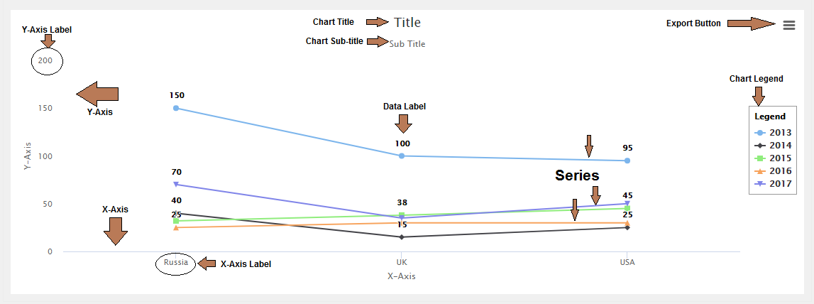
Notice: Chart Title, Chart Sub-title, Y-Axis Label, Y-Axis, X-Axis, X-Axis Label, Series, Chart Legend, Data Label and Export button.
Activate Module
- Purchase and download WowChartv3 from DNN Store, If you are not sure, select trial version for 15 days. Once you complete checkout, you will receive a notification email that tells you what are the activation details. In general, they are your Email and Invoice ID.
- First time when you add “WI Wow Chart - v3” module on a page, module will ask for activation as in the image below

- Hit the blue here link to open Activate form as in the image below:
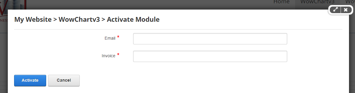
- Fill the form and hit Activate button, and if succeeded, activation message will disappear.
Getting Started
This manual will quickly get you started with your first chart. It's not meant to be exhaustive, so most of the options provided by WowChartv3 will be ignored for simplicity.
Let's get started!
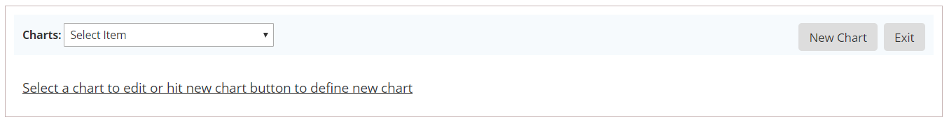
- Edit the page and hit “Setup Charts” button as in the image below

- To add a new chart, hit “New Chart” button as in the image below
Data Sources
Predefined Data Source
This sample intended to help you create Column Chart for static “manual” data source.
- Edit the page and hit “Setup Charts” button.
- Hit “New Chart” button to start creating the chart.
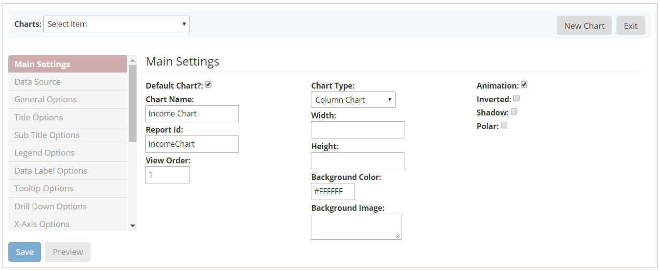
- Fill all mandatory fields and select Column Chart as type, as in the image below
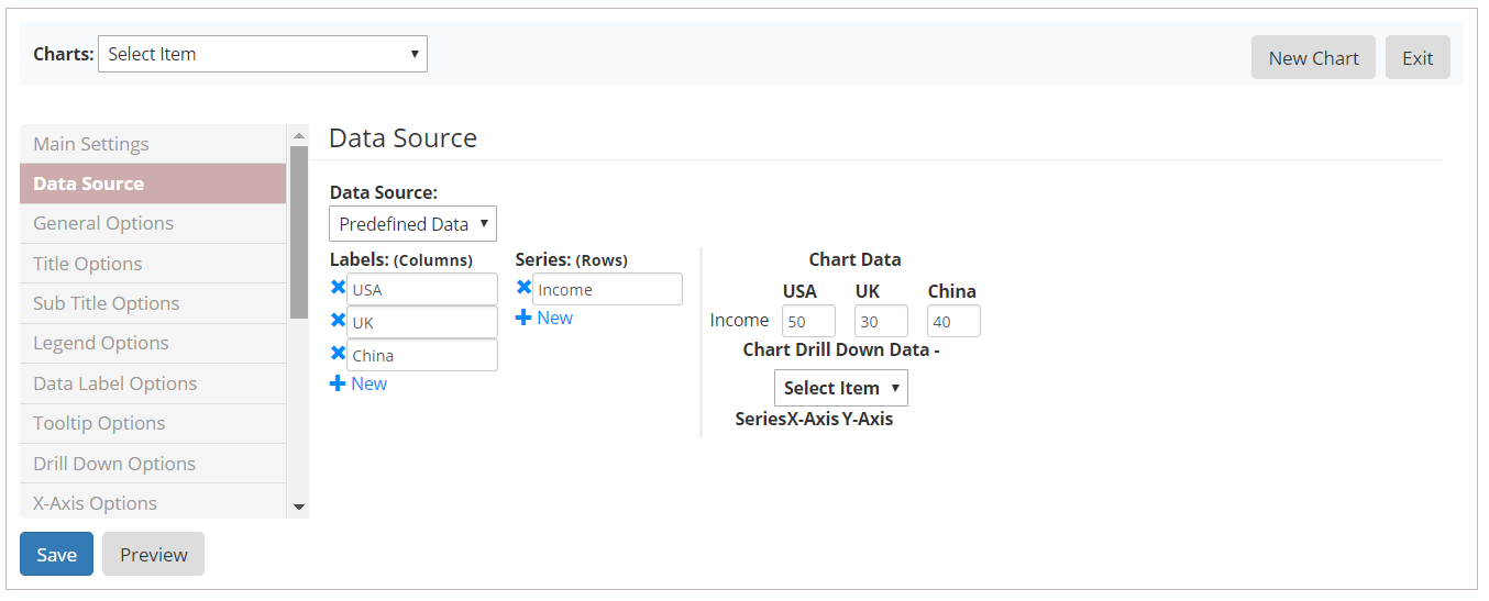
- From left vertical menu, select Data Source:
- select “Predefined Data” as data source.
- add three Labels: USA, UK and China
- add one Series: Income
- fill chart data: 50 for USA, 30 for UK and 40 for Chine.
As in the image below
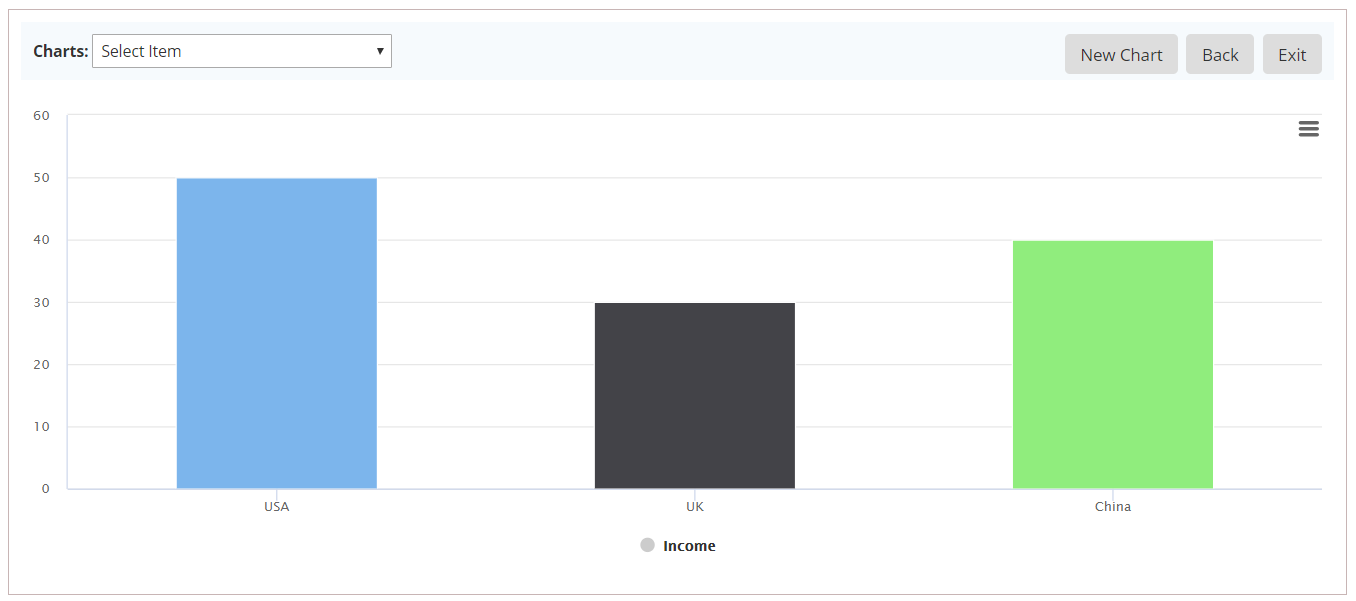
- From left vertical menu, select General Options:
- select “Color Per Point” to give different color for each label (USA, UK, China)
- You can preview chart before save it by hit Preview button.
SQL Data Source
This sample intended to help you create a Line Chart for SQL Table data source.
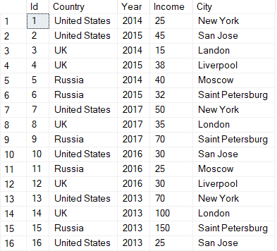
Chart data source is SQL Table called CountryIncome as in the image below
In the steps
- Edit the page and hit “Setup Charts” button.
- Hit “New Chart” button to start creating the chart.
- Fill all mandatory fields and select Line Chart.
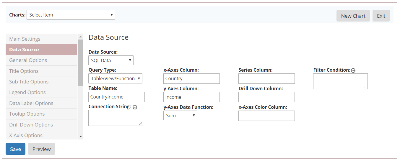
- From left vertical menu, select Data Source:
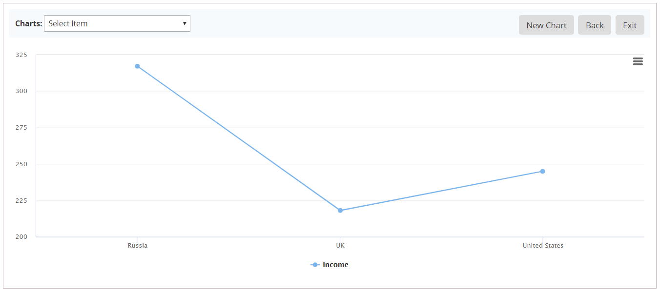
- Data Source: SQL Data.
- Query Type: Table/View/Function
- Table Name: CountryIncome
- X-Axes Column: Country
- Y-Axes Column: Income
- Y-Axes Data Function: Sum
As in the image below
- Hit Preview button to see how it will look like in live
CSV File Data Source
This sample intended to help you create a Bar Chart for CSV File data source.
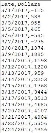
Chart data source is CSV file as in the image below
Note: Use DNN File Manager to create folder and upload CSV file.
In the steps
- Edit the page and hit “Setup Charts” button.
- Hit “New Chart” button to start creating the chart.
- Fill all mandatory fields and select Bar Chart.
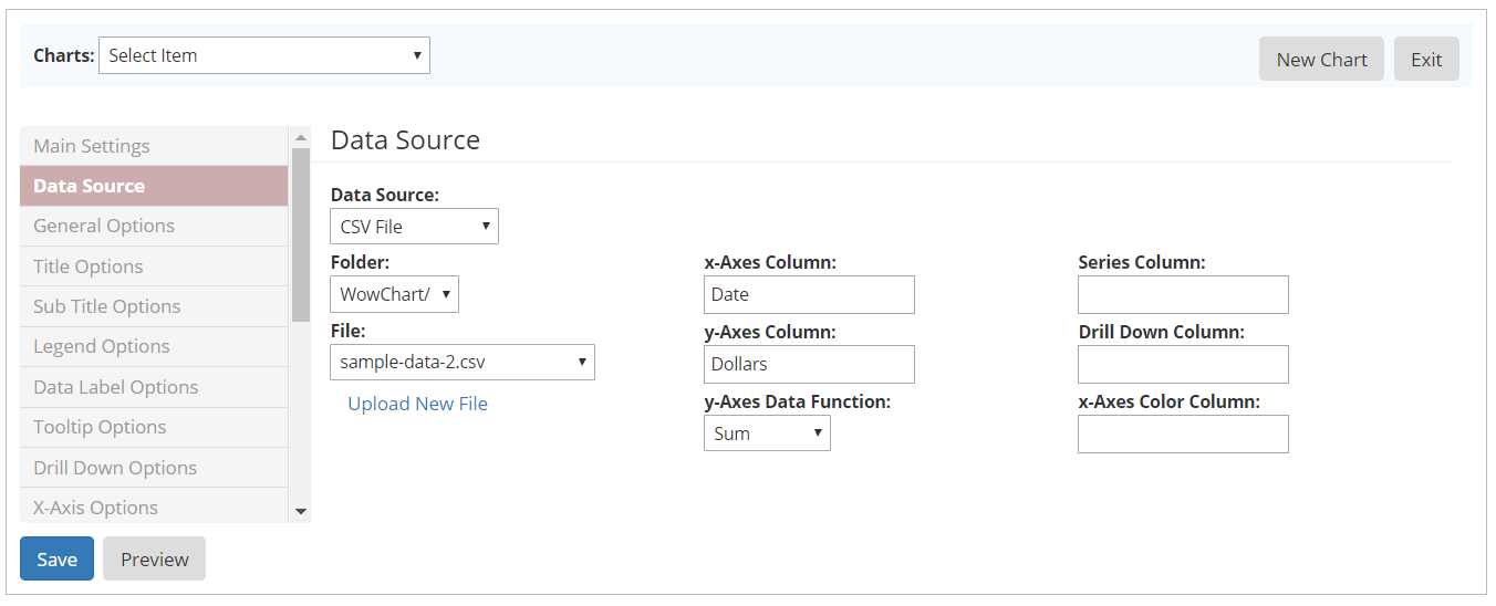
- At left vertical menu, select Data Source:
- Data Source: CSV File.
- Select folder where csv file located.
- Select csv file.
- X-Axes Column: Date.
- Y-Axes Column: Dollars
- Y-Axes Data Function: Sum
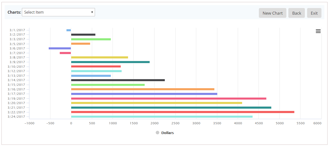
As in the image below
- From left vertical menu, select General Options:
- select “Color Per Point” to give different color for each label.
- Hit Preview button to see how it will look like in live
Great Features
Drilldown
The concept of inspecting increasingly high resolution data through clicking on chart items like columns or pie slices.
To enable this feature, you should set Drill Down column under Data Source left menu.
For SQL Statement, use Grouping Sets
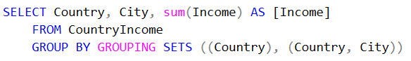
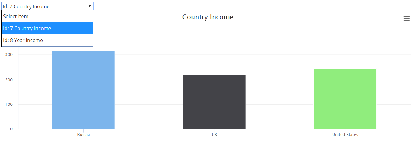
Chart Switcher
The concept is to create multiple charts and use drop down box to switch between charts easily, as in the image below
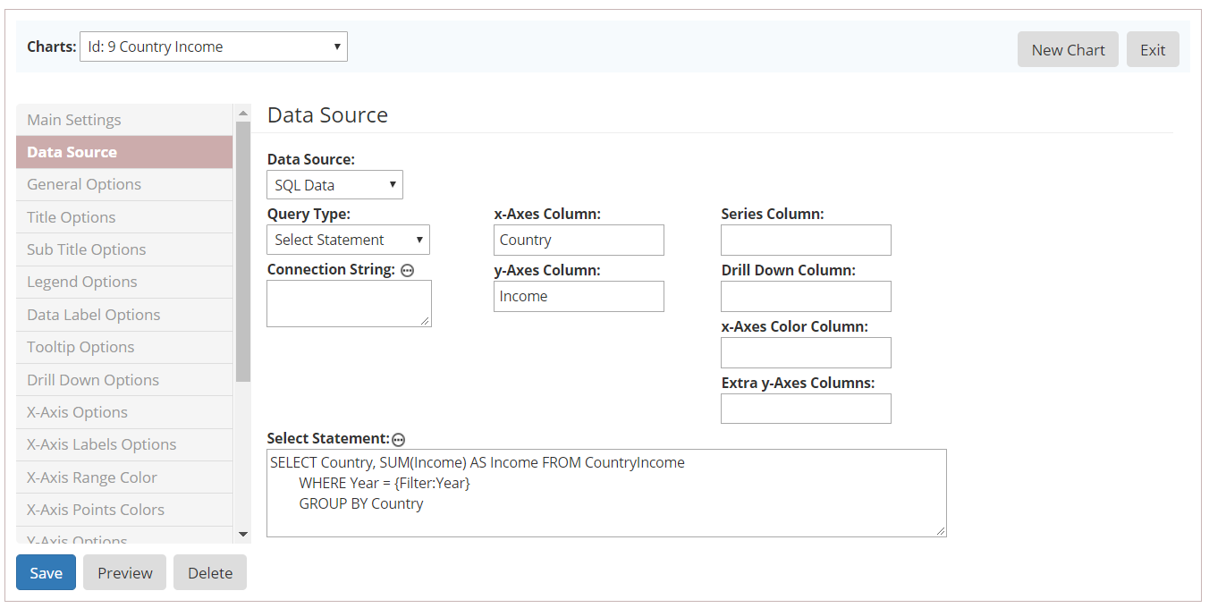
Filters
The concept is to filter chart based on user selection fields value, passed from external via javascript function called loadChart(reportId, chartPoint, filters)
Filter syntax: {Filter:<name>} and names are case insensitive.
In above SQL Data Source example, we created chart for Country Income for all Years.
The followings steps to filter chart data based on Year field selection:
- From left vertical menu, select Main Settings:
- type FilterChartSample in Report Id field.
- From left vertical menu, select Data Source:
- Data Source: SQL Data.
- Query Type: SQL Statement
- Select Statement
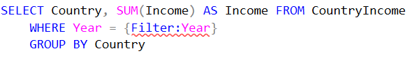
- X-Axes Column: Country
- Y-Axes Column: Income
As in the image below:
Now, create HTML above chart to render Year drop down box and Filter button, and use the following script in Filter button clicked event.
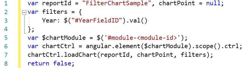
Notice, at line 5, you need to replace <module-id> with the actual chart module Id.
Chart Options
* means option is required.
-
General Options
|
|
Name
|
Type
|
Description
|
Example
|
|
1
|
Chart Type *
|
Predefined Options
|
The type of chart, can be any of the chart types
Line, Spline, Area, Areaspline, Column, Bar, Pie, Goal or Organization Chart
|
Line
|
|
2
|
Width
|
Number / Percentage
|
An explicit width for the chart. By default (when empty) the width is calculated from the offset width of the containing element. Defaults to null.
|
80% or 500px
|
|
3
|
Hight
|
Number / Percentage
|
An explicit height for the chart. If a number, the height is given in pixels. If given a percentage string (for example '56%'), the height is given as the percentage of the actual chart width. This allows for preserving the aspect ratio across responsive sizes.
|
80% or 500px
|
|
4
|
Background Color
|
Color Picker
|
The background color or gradient for the outer chart area. Defaults to #FFFFFF.
|
red or #00bb00
|
|
5
|
Background Image
|
Fee Text
|
The URL for an image to use as the chart background.
Note that for the image to be applied to exported charts, its URL needs to be accessible by the export server.
|
|
|
6
|
Animation
|
Checkbox
|
Set the overall animation for all chart updating. Animation can be disabled throughout the chart by clear this option
|
|
|
7
|
Inverted
|
Checkbox
|
Whether to invert the axes so that the x axis is vertical and y axis is horizontal
|
|
|
8
|
Shadow
|
Checkbox
|
Whether to apply a drop shadow to the outer chart area
|
|
|
9
|
Polar
|
Checkbox
|
When selected, cartesian charts like line,area and column are transformed into the polar coordinate system
|
|
-
Config Options
|
|
Name
|
Type
|
Description
|
Example
|
|
1
|
Pane Size *
|
Number / Percentage
|
The size of the pane, either as a number defining pixels, or a percentage defining a percentage of the plot are
|
85% or 500px
|
|
2
|
Pane Start Angle *
|
Number
|
The start angle of the polar X axis or gauge axis, given in degrees where 0 is north
|
|
|
3
|
Pane End Angle *
|
Number
|
The end angle of the polar X axis or gauge value axis, given in degrees where 0 is north
|
|
|
4
|
Chart Spacing *
|
Number
|
The distance between the outer edge of the chart and the content, like title or legend, or axis title or labels if present.
The numbers in the boxes designate top, right, bottom and left respectively.
|
|
|
5
|
Chart Margin *
|
Number
|
The margin between the outer edge of the chart and the plot area.
The numbers in the boxes designate top, right, bottom and left respectively
|
|
|
6
|
Stacking
|
Predefined Options
|
Whether to stack the values of each series on top of each other. Possible values are disable, "normal" to stack by value or "percent"
|
|
|
7
|
Color Per Point
|
Checkbox
|
When using automatic point colors pulled from the default colors collection, this option determines whether the chart should receive one color per series or one color per point.
|
|
|
8
|
Zoom
|
Predefined Options
|
Decides in what dimensions the user can zoom by dragging the mouse. Can be one of x, y or x & y.
|
|
-
Title Options
|
|
Name
|
Type
|
Description
|
Example
|
|
1
|
Text
|
Free Text
|
The title of the chart. To disable the title, clear it
|
Sales By Year
|
|
2
|
Align
|
Predefined Options
|
The horizontal alignment of the title. Can be one of "left", "center" and "right".
|
|
|
3
|
Vertical Align
|
Predefined Options
|
The vertical alignment of the title. Can be one of "top", "middle" and "bottom"
|
|
|
4
|
Font Size
|
Number
|
The font size of chart title in pixels
|
|
|
5
|
Font Color
|
Color Picker
|
The font color of chart title
|
red or #00bb00
|
|
6
|
Margin
|
Number
|
The margin between the title and the plot area, or if a subtitle is present, the margin between the subtitle and the plot area
|
|
-
SubTitle Options
|
|
Name
|
Type
|
Description
|
Example
|
|
1
|
Text
|
Free Text
|
The sub title of the chart. To disable the sub title, clear it
|
2010 - 2017
|
|
2
|
Align
|
Predefined Options
|
The horizontal alignment of the sub title. Can be one of "left", "center" and "right".
|
|
|
3
|
Vertical Align
|
Predefined Options
|
The vertical alignment of the sub title. Can be one of "top", "middle" and "bottom"
|
|
|
5
|
Font Color
|
Color Picker
|
The font color of chart sub title
|
red or #00bb00
|
-
Legend Options
|
|
Name
|
Type
|
Description
|
Example
|
|
1
|
Enabled
|
Checkbox
|
Enable or disable the legend
|
|
|
2
|
Align
|
Predefined Options
|
The horizontal alignment of the legend box within the chart area. Valid values are left, center and right.
|
|
|
3
|
Vertical Align
|
Predefined Options
|
The vertical alignment of the legend box. Can be one of top, middle or bottom
|
|
|
4
|
Layout
|
Predefined Options
|
The layout of the legend items. Can be one of "horizontal" or "vertical"
|
|
|
5
|
Title
|
Free Text
|
A title to be added on top of the legend
|
|
|
6
|
Background Color
|
Color Picker
|
The background color of the legend
|
red or #00bb00
|
|
7
|
Border Color
|
Color Picker
|
The color of the drawn border around the legend
|
red or #00bb00
|
|
8
|
Border Radius *
|
Number
|
The border corner radius of the legend
|
|
|
9
|
Border Width *
|
Number
|
The width of the drawn border around the legend
|
|
|
10
|
Floating
|
Checkbox
|
When the legend is floating, the plot area ignores it and is allowed to be placed below it
|
|
|
11
|
X-offset *
|
Number
|
The x offset of the legend relative to its horizontal alignment align within spacing left and spacing right. Negative x moves it to the left, positive x moves it to the right.
|
|
|
12
|
Y-offset *
|
Number
|
The vertical offset of the legend relative to it's vertical alignment vertical align within spacing top and spacing bottom. Negative y moves it up, positive y moves it down.
|
|
|
13
|
Label Format *
|
Free Text
|
A format string for each legend label, and formatting supports the followings:
- Variables: in pie chart {point.x} {point.y}
- Numbers:
- Two decimal places: {point.y:.2f}
- Thousands separator, no decimal places: {point.y:,.0f}
- Thousands separator, one decimal place: {point.y:,.1f}
- Dates: {value:%Y-%m-%d}
|
{name}
|
-
X-Axis Options
|
|
Name
|
Type
|
Description
|
Example
|
|
1
|
X-axis Text
|
Free Text
|
The axis title, showing next to the axis line
|
|
|
2
|
Minimum Value
|
Number
|
The minimum value of the axis. If empty the min value is automatically calculated
|
|
|
3
|
Line Width *
|
Number
|
The width of the line marking the axis itself
|
|
|
4
|
Line Color *
|
Color Picker
|
The color of the line marking the axis itself
|
red or #00bb00
|
|
5
|
Grid Line Width *
|
Number
|
The width of the grid lines extending the ticks across the plot area
|
|
|
6
|
Crosshair
|
Checkbox
|
Configure a crosshair that follows either the mouse pointer or the hovered point
|
|
-
X-Axis Label Options
|
|
Name
|
Type
|
Description
|
Example
|
|
1
|
Enabled
|
Checkbox
|
Enable or disable the axis labels
|
|
|
2
|
Format *
|
Free Text
|
A format string for the axis label, and formatting supports the followings:
- Variables: {point.x} {point.y}
- Numbers:
- Two decimal places: {point.y:.2f}
- Thousands separator, no decimal places: {point.y:,.0f}
- Thousands separator, one decimal place: {point.y:,.1f}
- Dates: {value:%Y-%m-%d}
|
{value}
|
|
3
|
Rotation *
|
Number
|
Rotation of the labels in degrees
|
|
|
4
|
Color *
|
Color Picker
|
The font color of the axis labels
|
red or #00bb00
|
|
5
|
Font Size *
|
Free Text
|
The font size of the axis labels, either in pixels or em font size unit
|
15px or 1.2em
|
|
6
|
Font Weight
|
Predefined Options
|
The font weight of the axis labels. Can be one of "normal" or "bold" or “bolder” or “lighter”
|
|
|
7
|
Padding *
|
Number
|
The pixel padding for axis labels, to ensure whitespace between them
|
|
-
X-Axis Range Color Options
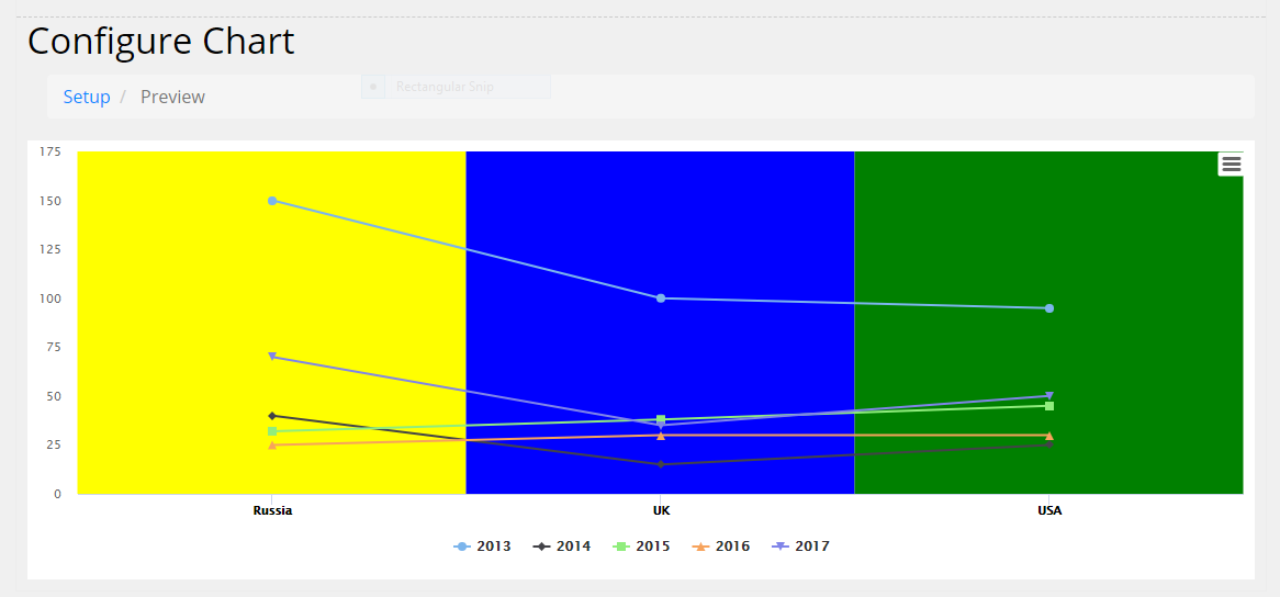
Define x-axis category background color, as shown below
-
Y-Axis Options
|
|
Name
|
Type
|
Description
|
Example
|
|
1
|
Y-axis Text
|
Free Text
|
The axis title, showing next to the axis line
|
|
|
2
|
Minimum Value
|
Number
|
The minimum value of the axis. If empty the min value is automatically calculated
|
|
|
3
|
Line Width *
|
Number
|
The width of the line marking the axis itself
|
|
|
5
|
Grid Line Width *
|
Number
|
The width of the grid lines extending the ticks across the plot area
|
|
|
6
|
Crosshair
|
Checkbox
|
Configure a crosshair that follows either the mouse pointer or the hovered point
|
|
-
Y-Axis Labels Options
|
|
Name
|
Type
|
Description
|
Example
|
|
1
|
Enabled
|
Checkbox
|
Enable or disable the axis labels
|
|
|
2
|
Format *
|
Free Text
|
A format string for the axis label, and formatting supports the followings:
- Variables: {point.x} {point.y}
- Two decimal places: {point.y:.2f}
- Thousands separator, no decimal places: {point.y:,.0f}
- Thousands separator, one decimal place: {point.y:,.1f}
- Numbers:
- Dates: {value:%Y-%m-%d}
|
{value}
|
|
3
|
Rotation *
|
Number
|
Rotation of the labels in degrees
|
|
|
4
|
Color *
|
Color Picker
|
The font color of the axis labels
|
red or #00bb00
|
|
5
|
Font Size *
|
Free Text
|
The font size of the axis labels, either in pixels or em font size unit
|
15px or 1.2em
|
|
6
|
Font Weight
|
Predefined Options
|
The font weight of the axis labels. Can be one of "normal" or "bold" or “bolder” or “lighter”
|
|
|
7
|
Padding *
|
Number
|
The pixel padding for axis labels, to ensure whitespace between them
|
|
-
Y-Axis Range Color Options
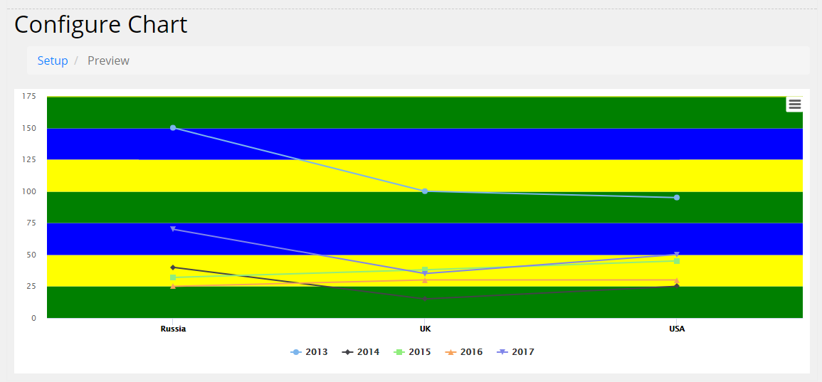
Define y-axis category background color, as shown below
-
Tooltip Options
|
|
Name
|
Type
|
Description
|
Example
|
|
1
|
Enabled
|
Checkbox
|
Enable or disable the tooltip
|
|
|
2
|
Header Format
|
Free Text
|
The HTML of the tooltip header line. Variables are enclosed by curly brackets. Available variables are point.key, series.name, series.color.
Formatting supports the followings:
- Variables: {point.x} {point.y}
- Numbers:
- Two decimal places: {point.y:.2f}
- Thousands separator, no decimal places: {point.y:,.0f}
- Thousands separator, one decimal place: {point.y:,.1f}
- Dates: {value:%Y-%m-%d}
|
|
|
3
|
Point Format
|
Free Text
|
The HTML of the point's line in the tooltip. Variables are enclosed by curly brackets. Available variables are point.x, point.y, series.name and series.color
|
|
|
4
|
Split
|
Checkbox
|
Split the tooltip into one label per series, with the header close to the axis. This is recommended over shared tooltips for charts with multiple line series, generally making them easier to read
|
|
|
5
|
Shared
|
Checkbox
|
When the tooltip is shared, the entire plot area will capture mouse movement or touch events. Tooltip texts for series types with ordered data (not pie, scatter, flags etc) will be shown in a single bubble. This is recommended for single series charts and for tablet/mobile optimized charts.
|
|
-
3D Options
|
|
Name
|
Type
|
Description
|
Example
|
|
1
|
Enabled
|
Checkbox
|
Whether to render the chart using the 3D functionality
|
|
|
2
|
Alpha *
|
Number
|
One of the two rotation angles for the chart
|
|
|
3
|
Beta *
|
Number
|
One of the two rotation angles for the chart
|
|
|
4
|
Depth *
|
Number
|
The total depth of the chart
|
|
-
Data Label Options
|
|
Name
|
Type
|
Description
|
Example
|
|
1
|
Enabled
|
Checkbox
|
Enable or disable the data labels
|
|
|
2
|
Format
|
Free Text
|
A format string for the data label
|
{y} {point.name}
|
|
3
|
Color
|
Color Picker
|
The text color for the data labels
|
red or #00bb00
|
|
4
|
Rotation
|
Number
|
Text rotation in degrees
|
|
|
5
|
Border Color
|
Color Picker
|
The border color for the data label
|
red or #00bb00
|
|
6
|
Border Radius
|
Number
|
The border radius in pixels for the data label
|
|
|
7
|
Border Width
|
Number
|
The border width in pixels for the data label
|
|
|
8
|
X offset
|
Number
|
The x position offset of the label relative to the point
|
|
|
9
|
Y offset
|
Number
|
The y position offset of the label relative to the point
|
|
-
Captions
|
|
Name
|
Type
|
Description
|
Example
|
|
1
|
Drill Up Text
|
Free Text
|
The text for the button that appears when drilling down, linking back to the parent series. The parent series' name is inserted for {series.name}
|
|
|
2
|
No Data
|
Free Text
|
The text to display when the chart contains no data
|
|
|
3
|
Print Chart
|
Free Text
|
The text for the menu item to print the chart
|
|
|
4
|
Download JPEG
|
Free Text
|
The text for the JPEG download menu item
|
|
|
5
|
Download PDF
|
Free Text
|
The text for the PDF download menu item
|
|
|
6
|
Download PNG
|
Free Text
|
The text for the PNG download menu item
|
|
|
7
|
Download SVG
|
Free Text
|
The text for the SVG download menu item
|
|
|
8
|
Download CSV
|
Free Text
|
The text for the CSV download menu item
|
|
|
9
|
Download XLS
|
Free Text
|
The text for the XLS download menu item
|
|
|
10
|
View Data
|
Free Text
|
The text for the View Data menu item
|
|
-
Drill Down Options
|
|
Name
|
Type
|
Description
|
Example
|
|
1
|
Title Location
|
Predefined Options
|
Where to show parent series name when drilling down. Can be one of "Don’t Show" or "Title" or “Subtitle”
|
|
|
2
|
Title Prefix
|
Free Text
|
A prefix text to show with the parent series name when drilling down
|
|
|
3
|
Hide Title
|
Checkbox
|
Whether to hide original chart title when drilling down
|
|
|
4
|
Hide Subtitle
|
Checkbox
|
Whether to hide original chart subtitle when drilling down
|
|
-
Export Options
|
|
Name
|
Type
|
Description
|
Example
|
|
1
|
Allow Exporting
|
Checkbox
|
Whether to enable chart exporting. Clear this option will hide the context button
|
|
|
2
|
External Server
|
Checkbox
|
Whether to use remote server for export or use current site to create image or pdf
|
|
|
3
|
Width
|
Number
|
The width of exported image or pdf
|
|
|
4
|
Allow Download CSV
|
Checkbox
|
Whether to enable CSV chart exporting. Clear this option will hide ‘Download CSV’ menu item
|
|
|
5
|
Allow Download XLS
|
Checkbox
|
Whether to enable XLS chart exporting. Clear this option will hide ‘Download XLS’ menu item
|
|
|
6
|
Allow View Data
|
Checkbox
|
Whether to enable View chart data. Clear this option will hide ‘View Data’ menu item
|
|
-
Series Colors
This section allows users define a color for each series
|
|
Name
|
Type
|
Description
|
Example
|
|
1
|
Fill Opacity *
|
Number
|
The default opacity/transparency of series
|
|
|
2
|
Name *
|
Free Text
|
The name of series
|
|
|
3
|
Color *
|
Color Picker
|
The color of series
|
|
-
X-Axis Points Colors
Users can define a color for each x-axis point
|
|
Name
|
Type
|
Description
|
Example
|
|
1
|
Name *
|
Free Text
|
The name of x-axis point name
|
|
|
2
|
Color *
|
Color Picker
|
The color of x-axis point
|
|
-
Module Preview
This section contains the html needed to display current chart in HTML module
|
|
Name
|
Type
|
Description
|
Example
|
|
1
|
Preview as Image
|
Checkbox
|
Whether to display chart as image when adding ‘Preview HTML Code’ into a page.
If this option is enabled, iframe will be removed
|
|
Sample HTML:
|
<iframe id="iframe-2722" src="http://localhost/dnn9/Charv2/ctl/Preview/mid/1488/iframe/iframe-2722?SkinSrc=[G]Skins%2f_default%2fNo+Skin&ContainerSrc=[G]Containers%2f_default%2fNo+Container" style="width:100%;height:100%;overflow:auto;"></iframe>
|